
Blog
The Color That Affects Your Mood – How to Choose It for Your Interior?
Choosing a color is not just a matter of aesthetics, but a true art of harmonizing space with emotions. Have you ever wondered why certain rooms make us feel like we're in an oasis of calm, while others pulsate with energy? The answer lies in the subtle yet powerful influence of colors. Discover the secrets of color psychology. Color psychology is a field of research dealing with the influence of colors [… ]

Choosing a colour is not just a matter of aesthetics, but a true art of harmonising a space with emotions. Have you ever wondered why certain rooms make us feel like we're in an oasis of calm, while others pulse with energy? The answer lies in the subtle yet powerful influence of colours. Discover the secrets of colour psychology.
Colour psychology is a field of research that studies the influence of colours on human emotions, behaviour and perception. The assumptions of colour psychology are related to the fact that colours can have a subjective and emotional effect on individuals.
How do colours affect emotions?
There are certain common associations between colours and emotions. For example, warm colours such as red, orange and yellow are often associated with energy, passion and joy, while cool colours like blue and green are associated with calm, stability and balance. Research suggests that the right choice of colours, e.g. in a work environment, can influence concentration, creativity and productivity. For example, some shades of blue are considered conducive to mental work. In colour psychology there is also a current related to colour therapy, where specific colours are recommended depending on therapeutic goals, such as relaxation or mood improvement.
Colours in interior design
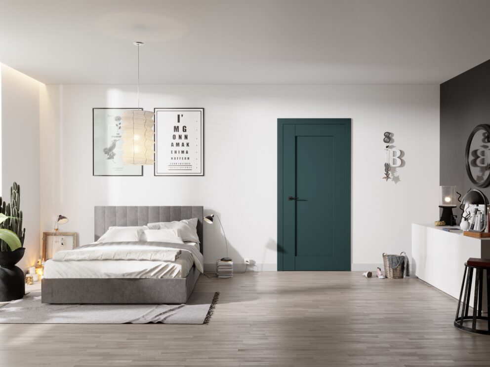
When furnishing or renovating a flat, remember the impact of colours on well-being. Recently, emphasis has been placed on ecology and a sustainable lifestyle, which is reflected in the popularity of various shades of green, associated with nature, the natural world and having a soothing effect on the senses. By choosing one of the shades of green, you can be sure that the colour will harmonise with natural materials such as wood.
Colourful, energetic accents, such as fuchsia, orange or yellow, are also gaining popularity, bringing joy to interiors. This year, in accessories, designers are pairing cool and warm colours: orange, red or yellow with blue or green. The minimalist style, which involves the use of subdued colours – white, grey and pastels such as dusty pink, is extremely fashionable. Contrasting single walls in a strong colour, serving as a counterpoint to the colours used in the interior, have also become popular. By experimenting with colour trends, you can confidently combine them, using natural, contrasting colours in minimalist interiors – for example, using coral orange, which Pantone declared the colour of the year 2024.
How to choose colours to match the character of a room and our preferences?
Choosing colours for an interior is a process that combines aesthetic and functional elements and personal preferences. Here are a few tips on how to choose colours to match both the character of a room and our individual tastes:
Understanding the character of the room:
- Think about what purpose the room will be used for. Colours in a bedroom may differ from colours in a kitchen or office. Consider what emotions and atmosphere you want to create in a given room.
Choosing a colour palette:
- Decide on a colour palette that matches the character of the room and your preferences. You can choose between cool, calm colours (e.g. light blue, green) and warm, energetic colours (e.g. red, orange).
Balance and contrast:
- Find a balance between different colours. Avoid too many intense colours that can overwhelm a room. Use contrast between walls, furniture and accessories.
Orientation in relation to light:
- Take into account the natural light entering the room. Light colors work well with well-lit rooms, while dark colors can work well in rooms with limited lighting.
Consolidate the concept:
- Before you start painting the walls, create a moodboard or concept that includes wall colors, furniture, textiles, and accessories. This will help you see how everything works together.
Test color samples:
- Before deciding on a specific color, test samples on the wall. Colors can look different depending on the lighting and the context of the room.
Pay attention to accents:
- Use color accents to highlight specific elements in the room. These can be cushions, decorative lamps, paintings, or rugs, and even doors.
Adjust to the interior style:
- Colors should harmonize with the interior style. For example, for minimalist interiors, it is worth choosing subdued and uniform colors, while in a modern one, you can experiment with contrasts and unusual combinations.
Thoughtful use of intense colors:
- An intense color can be a great accent, but use it sparingly, especially when it comes to larger surfaces. Intense colors can be overwhelming if used too abundantly.
Ask yourself questions:
- Do you like the color you chose in the long term? Does it introduce the desired atmosphere? Does it fit your lifestyle?
Door colors vs. room interior
The color of the door has a significant impact on the overall appearance of the room. Doors are an important decorative and functional element, so their color can affect the atmosphere, style, and impressions of the interior. When choosing door joinery, remember that it must harmonize with the style of the place. For example – white interior doors can perfectly match a classic or modern interior, while doors in intense colors can add energy to an eclectic-style room.
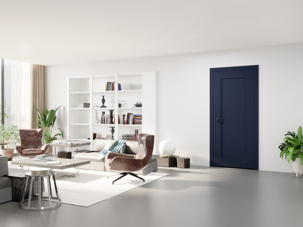
With a well-chosen door color, you can create a contrast with wall colors, which will add depth to the interior. A dark door color can also emphasize the architectural details of the room, its lines and forms, while light doors act much more subtly.
With a light door color, you can make the room appear brighter and more spacious, which is important in places with limited access to light. Door color can also affect the perception of proportions in the room. While light doors can add height, a dark color on the doors will do the opposite.
Interior doors can be in the same tone as the wall color, or even blend into them, an example of which are hidden doors Sara Eco 2 offering the possibility of finishing the leaf surface in wall colors and allowing for the effect of “disappearing doors.” By taking the opposite approach and choosing doors that contrast with the walls, we can give the room character and individuality, making the joinery an important decorative element.
The importance of color in shaping the atmosphere
The color of the door and other elements in a room is an important issue that can significantly affect the appearance of the interior. Color plays a key role in shaping the atmosphere, as it has the power to influence emotions, mood and the overall experience of a given room. It also affects its visual perception and proportions, defines the interior style, emphasizes architectural details, and often determines the function of a given room. The color scheme should therefore be well thought out, taking into account the style and function of the interior as well as your own preferences. Remember that choosing colors is a creative process, and the final choice should reflect your personal taste. Don't be afraid to experiment!
Are you looking for a door in an unusual color? Download the DRE catalogs and DRE Supreme, or visit one of our partner showrooms. You will find their addresses on our website.