
Blog
How to choose colors for interiors?
Not all whites are the same, and gray has many shades. How to combine colors in an interior so they work well together? How to choose the color of interior doors? We asked our expert architect Krzysztof Miruć. Is choosing the dominant color in an interior a simple matter? With color you can warm an interior, enlarge it, cool it, expand it, but you can also harm an interior. Playing with color in an interior can […]

Not all whites are the same, and grey has many shades. How to combine colours in an interior so that they work together? How to choose the colour of interior doors? We asked our expert architect Krzysztof Miruć.
Is choosing the dominant colour in an interior a simple matter?
A colour can warm up an interior, make it larger, cool it down, expand it, but it can also hurt the interior. Playing with colour in an interior may seem very simple, but in fact it is unfortunately quite difficult. You have to remember that every colour looks completely different in an interior. Therefore, when choosing colours for a living room or bedroom, you should build a base of primary colours to which you will match and combine shades that are close in tone or even contrasting.
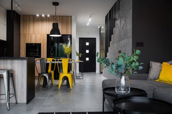
To avoid colour mistakes, choose a safe base colour and vivid colours in accessories. | visualisation: Sandra Białkowska, Dobry Układ.
Are there colours we should avoid in interiors?
We must ask ourselves the basic question: what colour do we like? After all, it is about feeling good in the interior. Let us remember, however, that every colour we use can be more or less intense. They can be more "pure" or lean toward the tone of other colours.
A perfect example is the popular grey. One will lean toward beige and brown, another toward blue, and yet another toward green. The most important thing is to choose the tone you like most, then use it, match individual things to it. Put them together so they form a harmonious whole.
So how should we combine different colours so as not to hurt the interior?
You can use the colour wheel, which shows roughly how to combine colours so they look good together. I would recommend playing with the colour wheel on the wall to experienced investors, because combining contrasting colours can be difficult and risky. For those who lack colour courage, I would recommend painting the interior in a muted white, which can be complemented with colourful accessories.
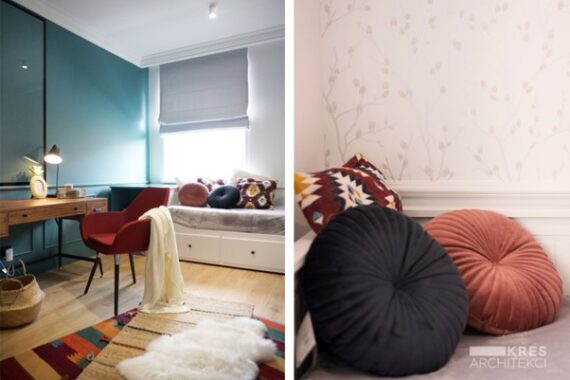
A base colour combined with a vivid shade ensures an aesthetic effect | design: Ewelina, Mateusz Ozdoba – Kres Architekci
Anyone who has started their adventure with interior design has encountered colour numbering and complicated colour names. Can you tell us how to use colour samples correctly?
On colour samples there is always a colour number and letters that show which way the colour leans. R means a hint of red, G green, and B blue. Fortunately, colour charts usually explain this. When using samples, be sure to cover the other colours on the page with a white sheet, otherwise the colour you choose will pick up the shades of the neighbouring ones.
We know that the colours around us affect our mood. Is it worth being guided by that?
Both yes and no. That is theory. But what if I relax perfectly in red? These are individual matters. I always assume that interior design is like dressing. It starts with an idea for a styling, you choose a base item, then match accessories to it, and finally you create make-up and hair. It is similar with interiors. Let us start with an idea for them, not with colour. Of course, it also happens that colour is the main inspiration for the whole interior, where it is to appear, in what form, etc. Here again I will refer to fashion. If you have an idea for a red bag, you will probably wear a black dress and shoes with a red sole. That is also an idea for playing with colour. So we always start from the idea for the styling, the idea for the interior, then it will be easier for us.
And what mistakes and experiments should we avoid?
Better is the enemy of good. In my opinion, the riskiest situations are when a specialist comes to us and proposes such an "other, interesting" solution, even painting a triangle on the ceiling. If we get the thought to do anything just so it stands out, we immediately throw such a thought away. Consistency of action and conscious choice are the foundation.
How to match door colour to the interior?
Here we follow two rules. Interior doors can be colour-matched to the colour of the wall, or they can stand out against it. In that case, for a dark wall we choose a light door leaf or vice versa. Leaves can match one of the elements; after all, they are also part of the furnishings. So, if we play with veneer or a laminated board imitating veneer, it is good for the same material to be repeated somewhere else too. If we do not have an idea for that, then ordinary, smooth door leaves on a light wall will do the job.
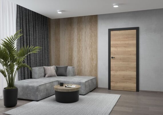
It is worth repeating the colour from the doors in the interior | door model DRE Nova 10 oak Halifax
We do not have to make door leaves a decorative element. Quite the opposite. They can disappear in the interior. Door leaves with a hidden frame Sara Eco 2 can be painted with wall paint, wallpapered or covered with structural plaster.
Want to hide the doors in the interior? The Sara Eco 2 model can be painted in the colour of the wall | visualisation Sandra Białkowska, Dobry Układ.
Do doors have to be in one colour?
Of course they do not have to be. The popular model Vetro E-Synchro is a combination of a deep black frame with a door leaf in a wood colour. Colour can be introduced, for example, by choosing black glazing for light doors. Such a combination can be achieved by choosing painted doors Vetro E.
How to play with the timeless combination of white and black in the interior?
Let us start with what "a timeless combination" means. It means that it is a proven composition that will look aesthetically pleasing for years to come. When combining black with white, you need to know moderation, because even such a universal combination can look bad if we overdo it.
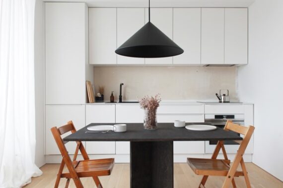
A well-designed interior in black and white is a timeless combination | interior design: Karolina Golińska
All earth colours combined with a strong shade: white, black, dirty grey, navy or anthracite will look good and timeless, because they will not tire us. Any seasonal, fashionable colours, such as coral and violet at one time, are better used in accessories. The quickly changing fashion for colours will mean we have greater opportunities to play. It is easier to change a cushion than to repaint a wall :).